
While Florence Nightingale is known as the mother of modern nursery, less is publicly known about her avant-garde approach to the use of data to gain insights into the challenges that hospitals faced in the mid-18th century. Before the concept of data science was even a thing, the “lady with the lamp” had already foreseen the fundamental role that data analysis could play. It is thanks to her mathematical and statistical skills that she was able to save many Englishmen from deadly infections at Scutari Hospital in Istanbul.
Why Florence Nightingale was called to Turkey?
In 1856, in response to the high mortality rate registered in the hospital set up by the British military in Istanbul, the British government sent Florence Nightingale to improve the sanitary situation. She was faced with disastrous conditions: fleas and parasites were everywhere, basic supplies such as soap and towels were missing, and the food supply chain did not meet the minimum sanitary conditions. By looking at the scene in front of her eyes, she immediately realized that soldiers were seriously endangered by the diseases spreading in the hospital.
How did she go about solving the issue?
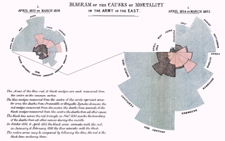
Given her solid background in mathematics and her being a “passionate statistician”, as Sir Edward T. Cook called her, she immediately started collecting data on the state of the supplies and the causes of death. The reality highlighted by her bar graphs and famous “coxcomb” diagram was staggering; British soldiers were dying at an incredibly higher rate than the English Male population, and most of those deaths did not come from battle wounds but from the poor sanitary conditions under which hospitals were working.
- Nightingale’s coxcomb graph representing causes of death in the Army over two years
2. Nightingale’s bar graph representing mortality of Army at home versus the English Male Population

Having gotten the attention of the British crown and government, Nightingale was able to get a team of volunteers who helped her gather more data and write reports, which were later made available to the public. Thanks to her work, policy-makers and healthcare professionals were given a better idea of what needed to be done in the public health sector, and deaths were significantly reduced in military hospitals.
Florence Nightingale’s work in numbers:
38: nurses who accompanied her to Scutari Hospital
17-19-20 per thousand: the mortality of those in the Line, Artillery, and Guards
11 per thousand: the mortality of English civilians
40%: the death rate of Army Men at the hospital when she arrived
2%: the death rate at the hospital after her work
What were the innovations that Nightingale introduced?
A key aspect in the data analysis and visualization work that was carried out by the “Lady with the Lamp” was the simplification of the graphs. Nightingale significantly reduced the number of bars in a single plot and made sure that the writing would be horizontal so that people could more easily interpret the meaning of the graphs. Before this, statistics and plots were meant for professionals and academics who needed to look up specific values, but Nightingale’s method allowed to distribute her analysis to others as well. Those who were able to read her lesser known work “Notes Affecting the Health, Efficiency and Hospital Administration of the British Army” agreed that it was “a treasury of authentic fact” and “a gift to the Army, and the country altogether priceless.”
She was among the first to employ data to serve a social and public purpose and to produce knowledge about the reality that surrounds us — something to which we are now accustomed but which represented a great innovation at the time.
How is data used today?
Recent global events have shown the fundamental purpose that statistics and data visualization serve to healthcare and journalism, among many other fields. We have all gotten used to seeing a variety of graphs and charts trying to make sense of the Covid-19 pandemic, but very often we must be careful when attempting to decipher them. Hard-to-read graphs, missing labels, and cluttered data often represent an obstacle for the public when trying to understand what is being depicted.
1. Example of a really cluttered infographic with static data

Even worse, in some cases, we might see deliberately confusing charts that misrepresent reality. The infamous graph used by CNN to represent people’s agreement with the Court’s decision on the Terry Schiavo case, for example, does not show the 0 baseline, therefore making it look like three times as many Democrats agreed with the ruling compared to Republicans and Independents, while in reality, the difference was actually 62% against 54%.
2. Example of a misleading graph representing which does not show the 0 baseline, similar to the one used by CNN

One lesson that can be learned from Florence Nightingale is that readability and simplicity are key features of well-made graphs, which can then have an impact on both the measures that are taken to solve potential issues and the idea that the public has about the problem. Data visualization is now an integral part of story-telling and reporting, and it needs to be treated as such, maintaining clarity and straightforwardness as its key features.
Rogers, Simon. “Florence Nightingale, data journalist: information has always been beautiful”, The Guardian, 13 August 2010. https://www.theguardian.com/news/datablog/2010/aug/13/florence-nightingale-graphics
Edwin W. Kopf, Florence Nightingale as a Statistician, Publications of the American Statistical Association, December 1916, Vol. 15, No. 116, pp. 388-404. https://www.jstor.org/stable/pdf/2965763.pdf
“Misleading graphs in Real Life”, Statistics How To, https://www.statisticshowto.com/probability-and-statistics/descriptive-statistics/misleading-graphs/
Jennifer Hawley and Kasper Sierslev, “Florence Nightingale: Data Visualization Pioneer”, Data Classroom. https://about.dataclassroom.com/ready-to-teach/florence-nightingale
Lilly Smith, “The untold story of how Florence Nightingale used data viz to save lives”, Fast Company, 18 May 2021. https://www.fastcompany.com/90637011/the-untold-story-of-how-florence-nightingale-used-data-viz-to-save-lives
N. A., “Florence Nightingale: The pioneer statistician”, Science Museum, 10 December 2018. https://www.sciencemuseum.org.uk/objects-and-stories/florence-nightingale-pioneer-statistician
- This article was edited by Olivia Flaherty-Lovy, who participates in Journo’s New Horizons internship program for international students.


